
30. Canucks
This is a shitty idea with shitty execution. It barely passes as a C, everything about it is terrible.
29. Ducks

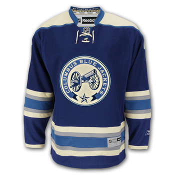
28. Blue Jackets

This is a shame because Columbus has the best third jersey around. But this color scheme and design are cloying.
27. Islanders
I get it. It's the island. But at small sizes it just looks like a stripe with a shitty brushstroke technique. The fonts are weak. The Y hockey stick doesn't match so it's a piss-poor job all-around.
26. Capitals

This isn't as offensive as the bottom four, but it's pretty bad. You can't just throw a hockey stick into anything and have it a be a good hockey logo, in fact, it's a recipe for a bad one. And the washington is part of the logo but unreadable in normal use. At least their color scheme is appropriate.
25. Stars

This is shite. Loses points for being brand new and being a downgrade from their old logo. It's a D in a star. Someone decided that a D on an angle was more impressive than a regular D. Italics are intimidating!
24. Flames
23. Penguins
22. Predators
21. Sharks

20. Kings
19. Coyotes

It doesn't show up that well in a small size, but it's not awful. A little boring but it's a decent coyote.
18. Flyers

To make this list, I started by organizing them into best, worst, and in between. 13 teams fell into my worst category. As I started to rank them I kept moving this up because it has all the elements of logos I like. It just doesn't do it for me. Maybe it's the color scheme. Even with no "bad" elements, it's still sort of ugly.
17. Hurricanes

This was the worst logo on the article I linked earlier and I wasn't sure why. It's a decent graphical representation of a hurricane, the symmetry is pretty nice (though I wish it was perfect). It's not great, but it's a lot better than the Canucks. Of course, it does slightly resemble a butthole.
16. Panthers

This is hit and miss. I appreciate the symmetry. But the gold is an ugly shade and it's trying pretty hard.
PART TWO TO COME LATER
No comments:
Post a Comment