Over the last week the USMNT crest has grown on me. At first I hated it. I've come to accept it's not terrible. Though I thought it would look better in a one-color version. So I made this, gave it a little texture. Done.
Showing posts with label logos. Show all posts
Sunday, July 06, 2014
Saturday, July 05, 2014
Improving the Avalanche Logo
I noted last summer that this logo would look better without the random black section. Here's proof.
Friday, June 28, 2013
Ranking NHL Logos, Part Two
Here was part one.
15. Devils
It's very cartoony. When I look at it, I just see an N, not a N and J. But partly because they Devils have been consistently good in my lifetime, it seems not so bad. If an expansion team came out with this, I'd hate it.
14. Avalanche
It would be better without the black in the lower right. Middle of the pack seems fair.
13. Oilers
10. Rangers
Attention LA: this is how you do a crest. Nice use of lines and curves, red white and blue done in a non-obtrusive manner. Strong lettering.
9. Canadiens
This is a little bit like judging the McDonald's golden arches. What it represents is the oldest, most storied franchise. The logo itself, is classic but kind of bland. The H is a nice touch, but still, it's not in the top 5.
8. Senators
If this was done today, there are so many ways it could have gone wrong. I love how it's not trying too hard.
7. Sabres
A great example of going back to what was working. Buffalo and Sabres all in one neat circle. The Gold is a nice touch.
6. Lightning
Probably a better ranking than most would give it. But I love how clean and flat it is. One color. Amazing how simplicity can work in your favor.
5. Bruins
Simple and strong. Just the right amount of detail. The B by itself would be not enough. Circles help. Notice how we haven't seen a hockey stick in the top 15.
4. Jets
3. Blackhawks
2. Maple Leafs
I really had a hard time deciding between 1 and 2. They're both one color which goes a long way. They both have iconic shapes. The type is lovely on the leafs logo. But ultimately I gave the nod to Detroit because it didn't need any letters.
1. Red Wings
Simple and complex all at once. There's a concept that represents the city well but it's done it a one-color clean way. What's not to like?
15. Devils
It's very cartoony. When I look at it, I just see an N, not a N and J. But partly because they Devils have been consistently good in my lifetime, it seems not so bad. If an expansion team came out with this, I'd hate it.
14. Avalanche
It would be better without the black in the lower right. Middle of the pack seems fair.
13. Oilers
It's pleasing. The type gives it character. It's nice that they haven't tried to update it to be more modern/aggressive. Clean.
12. Blues
It's similar to the Red Wings in concept, but nowhere near as pleasing. Still it's nice and clean. No need for any letters.
11. Wild
I was shocked to see this so low on the original list. It's very Minnesota, a nice landscape with hidden animal bonus. The green is lovely.10. Rangers
Attention LA: this is how you do a crest. Nice use of lines and curves, red white and blue done in a non-obtrusive manner. Strong lettering.
9. Canadiens
This is a little bit like judging the McDonald's golden arches. What it represents is the oldest, most storied franchise. The logo itself, is classic but kind of bland. The H is a nice touch, but still, it's not in the top 5.
8. Senators
If this was done today, there are so many ways it could have gone wrong. I love how it's not trying too hard.
7. Sabres
A great example of going back to what was working. Buffalo and Sabres all in one neat circle. The Gold is a nice touch.
6. Lightning
Probably a better ranking than most would give it. But I love how clean and flat it is. One color. Amazing how simplicity can work in your favor.
5. Bruins
Simple and strong. Just the right amount of detail. The B by itself would be not enough. Circles help. Notice how we haven't seen a hockey stick in the top 15.
4. Jets
A great example that older doesn't have to mean more classic. The old logo was a dull attempt at combining a Jet into the letters and using a hockey stick as a J. This feels modern and like it was the right choice 50 years ago as well. Nice job.
3. Blackhawks
We've seen how simplicity can work in your favor, here's one that shows how complexity can be done right. There are a lot of details, but they're done in a clean, simple way to create something special.
2. Maple Leafs
I really had a hard time deciding between 1 and 2. They're both one color which goes a long way. They both have iconic shapes. The type is lovely on the leafs logo. But ultimately I gave the nod to Detroit because it didn't need any letters.
1. Red Wings
Simple and complex all at once. There's a concept that represents the city well but it's done it a one-color clean way. What's not to like?
Thursday, June 27, 2013
Ranking NHL Logos
I saw this piece of shit article and figured I could do better.
30. Canucks
This is a shitty idea with shitty execution. It barely passes as a C, everything about it is terrible.
29. Ducks
Just bland. Feel like it's trying really hard to be from the future.
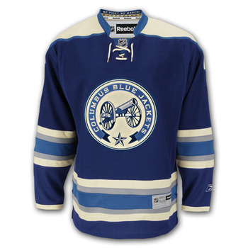
28. Blue Jackets
This is a shame because Columbus has the best third jersey around. But this color scheme and design are cloying.
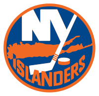
27. Islanders
I get it. It's the island. But at small sizes it just looks like a stripe with a shitty brushstroke technique. The fonts are weak. The Y hockey stick doesn't match so it's a piss-poor job all-around.
26. Capitals
This isn't as offensive as the bottom four, but it's pretty bad. You can't just throw a hockey stick into anything and have it a be a good hockey logo, in fact, it's a recipe for a bad one. And the washington is part of the logo but unreadable in normal use. At least their color scheme is appropriate.
25. Stars
This is shite. Loses points for being brand new and being a downgrade from their old logo. It's a D in a star. Someone decided that a D on an angle was more impressive than a regular D. Italics are intimidating!
24. Flames
I don't like logos that are cartoony or trying to be aggressive. This falls into cartoony. Although I guess it's also trying to be aggressive.
23. Penguins
Cartoony. And there's that hockey stick. It feels like they think they're ironic or something for using this. A downgrade from where they were.
22. Predators
Aggresive. It's at least well-done. Just boring.
21. Sharks
The holy trinity. Cartoony, agressive and a hockey stick! I think you could have an awesome logo for a shark. Just the fin would be exciting. This seems silly.
20. Kings
This doesn't feel like a logo. I wouldn't mind just the crown. I do appreciate that they've dropped the purple.
19. Coyotes
18. Flyers
To make this list, I started by organizing them into best, worst, and in between. 13 teams fell into my worst category. As I started to rank them I kept moving this up because it has all the elements of logos I like. It just doesn't do it for me. Maybe it's the color scheme. Even with no "bad" elements, it's still sort of ugly.
17. Hurricanes
This was the worst logo on the article I linked earlier and I wasn't sure why. It's a decent graphical representation of a hurricane, the symmetry is pretty nice (though I wish it was perfect). It's not great, but it's a lot better than the Canucks. Of course, it does slightly resemble a butthole.
16. Panthers
This is hit and miss. I appreciate the symmetry. But the gold is an ugly shade and it's trying pretty hard.
PART TWO TO COME LATER
30. Canucks
This is a shitty idea with shitty execution. It barely passes as a C, everything about it is terrible.
29. Ducks
Just bland. Feel like it's trying really hard to be from the future.
28. Blue Jackets
This is a shame because Columbus has the best third jersey around. But this color scheme and design are cloying.
27. Islanders
I get it. It's the island. But at small sizes it just looks like a stripe with a shitty brushstroke technique. The fonts are weak. The Y hockey stick doesn't match so it's a piss-poor job all-around.
26. Capitals
This isn't as offensive as the bottom four, but it's pretty bad. You can't just throw a hockey stick into anything and have it a be a good hockey logo, in fact, it's a recipe for a bad one. And the washington is part of the logo but unreadable in normal use. At least their color scheme is appropriate.
25. Stars
This is shite. Loses points for being brand new and being a downgrade from their old logo. It's a D in a star. Someone decided that a D on an angle was more impressive than a regular D. Italics are intimidating!
24. Flames
I don't like logos that are cartoony or trying to be aggressive. This falls into cartoony. Although I guess it's also trying to be aggressive.
23. Penguins
Cartoony. And there's that hockey stick. It feels like they think they're ironic or something for using this. A downgrade from where they were.
22. Predators
Aggresive. It's at least well-done. Just boring.
21. Sharks
The holy trinity. Cartoony, agressive and a hockey stick! I think you could have an awesome logo for a shark. Just the fin would be exciting. This seems silly.
20. Kings
This doesn't feel like a logo. I wouldn't mind just the crown. I do appreciate that they've dropped the purple.
19. Coyotes
It doesn't show up that well in a small size, but it's not awful. A little boring but it's a decent coyote.
18. Flyers
To make this list, I started by organizing them into best, worst, and in between. 13 teams fell into my worst category. As I started to rank them I kept moving this up because it has all the elements of logos I like. It just doesn't do it for me. Maybe it's the color scheme. Even with no "bad" elements, it's still sort of ugly.
17. Hurricanes
This was the worst logo on the article I linked earlier and I wasn't sure why. It's a decent graphical representation of a hurricane, the symmetry is pretty nice (though I wish it was perfect). It's not great, but it's a lot better than the Canucks. Of course, it does slightly resemble a butthole.
16. Panthers
This is hit and miss. I appreciate the symmetry. But the gold is an ugly shade and it's trying pretty hard.
PART TWO TO COME LATER
Friday, September 07, 2012
Revamped NFL Logos
I saw a site that redesigned NFL logos. And then I saw another one. And then some designers that did some for some teams. So I saved them and am here to go team-by-team, rank my favorites and give some commentary. I've listed my favorites at the top, per team.
New England Patriots
Not a strong start. Don't love any of these three. The second one is better designed, but just doesn't work for a football logo.
New York Jets
Now we're talking. This first one is snazzy. And then you see that it has a N Y in the logo. The second one is sharp, perhaps a little too futuristic.
Buffalo Bills
I feel like the retro look fits Buffalo. The second one is cartoony and the third one is a god-awful rendition of the shitty Sabres logo that everyone hated.
Miami Dolphins
The Dolphins was a popular choice. All of these are pretty good, but I like how the first one has a great looking dolphin and it works as a D in the script.
New England Patriots
Not a strong start. Don't love any of these three. The second one is better designed, but just doesn't work for a football logo.
New York Jets
Now we're talking. This first one is snazzy. And then you see that it has a N Y in the logo. The second one is sharp, perhaps a little too futuristic.
Buffalo Bills
I feel like the retro look fits Buffalo. The second one is cartoony and the third one is a god-awful rendition of the shitty Sabres logo that everyone hated.
Miami Dolphins
The Dolphins was a popular choice. All of these are pretty good, but I like how the first one has a great looking dolphin and it works as a D in the script.
Pittsburgh Steelers
This is probably the best set of three in the post. It's hard to even pick a favorite.
Baltimore Ravens
The bottom one isn't bad, but the top one takes a cool element they already have and improves upon it. Not easy.
Cincinnati Bengals
These are both super shitty. But the bottom one isn't even a logo.
Cleveland Browns
I actually like all three logos for the Browns. My favorite would be to take the top logo and lose the words.
Indianapolis Colts
Again I would keep the horseshoe and lose the words.
Jacksonville Jaguars
Some teams are just hard to design I guess. I hate all of these. The last one is nothing. The second one looks like a snake. The top one wins by default.
Tennessee Titans
These are all sort of interesting and I want to like #2 with the face, but it's not quite right.
Houston Texans
All of these are okay, but the first one is boss.
Denver Broncos
Don't like either of these. I prefer the throwback D logo.
Oakland Raiders
The bottom one is a cartoon joke. The top one is badass.
San Diego Chargers
So I sort of like all three...except none of them are quite right. For San Diego, I like powder blue and lightning. No other team has lightning, so I think it's a mistake to lose that and insert a horse. The middle one has powder blue and lightning, but has a jumble of letters. And I like that the last one tried to use lightning and combine it with a Chargers' C...except that it looks like a 5 and there's no powder blue.
Kansas City Chiefs
None of these are very good, I might like the first one if the arrowhead pointed to the right.
Dallas Cowboys
Fucking terrible. They should have done what they did for the Bears and Saints below. When you have a perfect, classic logo, all you can try to do is keep and add some flavor. Not ruin it with a bandito.
New York Giants
Philadelphia Eagles
Again, I think the retro look works. The bottom eagle is cheesy.
Chicago Bears
I'm impressed. The top one took a virtually perfect logo and gave it a nice revamp.
Green Bay Packers
Ugh. Fucking awful again. The bottom one might be the worst on this page.
Detroit Lions
So bad. Why are they doing this to me?
Minnesota Vikings
I like the top one. The bottom one isn't the worst.
Atlanta Falcons
These are both pretty bad.
New Orleans Saints
The bottom one is a joke, right? I could do with a little less grunge on the top one, but at least it retained the important parts.
Carolina Panthers
CP are not letters to build a logo around.
Tampa Bay Bucs
Three logos this time and I like them. Love how the sword is in the 2nd one, but the first one just has a nice feel.
St. Louis Rams
More shit. The second one isn't even a logo.
Seattle Seahawks
Credit for making the top one clearly a sea hawk.
Arizona Cardinals
The top one is pretty good. Combines a desert scape with the bird and the key letter. The bottom one is SHITE.
San Francisco 49ers
We finish strong with four choices. The top one is pretty killer.
This is probably the best set of three in the post. It's hard to even pick a favorite.
Baltimore Ravens
The bottom one isn't bad, but the top one takes a cool element they already have and improves upon it. Not easy.
Cincinnati Bengals
These are both super shitty. But the bottom one isn't even a logo.
Cleveland Browns
I actually like all three logos for the Browns. My favorite would be to take the top logo and lose the words.
Indianapolis Colts
Again I would keep the horseshoe and lose the words.
Jacksonville Jaguars
Some teams are just hard to design I guess. I hate all of these. The last one is nothing. The second one looks like a snake. The top one wins by default.
Tennessee Titans
These are all sort of interesting and I want to like #2 with the face, but it's not quite right.
Houston Texans
All of these are okay, but the first one is boss.
Denver Broncos
Don't like either of these. I prefer the throwback D logo.
Oakland Raiders
The bottom one is a cartoon joke. The top one is badass.
San Diego Chargers
So I sort of like all three...except none of them are quite right. For San Diego, I like powder blue and lightning. No other team has lightning, so I think it's a mistake to lose that and insert a horse. The middle one has powder blue and lightning, but has a jumble of letters. And I like that the last one tried to use lightning and combine it with a Chargers' C...except that it looks like a 5 and there's no powder blue.
Kansas City Chiefs
None of these are very good, I might like the first one if the arrowhead pointed to the right.
Dallas Cowboys
Fucking terrible. They should have done what they did for the Bears and Saints below. When you have a perfect, classic logo, all you can try to do is keep and add some flavor. Not ruin it with a bandito.
New York Giants
I'm a sucker for skylines.
Washington
This might be the biggest disparity. The top one is elegant. The bottom one is ghastly.
Philadelphia Eagles
Again, I think the retro look works. The bottom eagle is cheesy.
Chicago Bears
I'm impressed. The top one took a virtually perfect logo and gave it a nice revamp.
Green Bay Packers
Ugh. Fucking awful again. The bottom one might be the worst on this page.
Detroit Lions
So bad. Why are they doing this to me?
Minnesota Vikings
I like the top one. The bottom one isn't the worst.
Atlanta Falcons
These are both pretty bad.
New Orleans Saints
The bottom one is a joke, right? I could do with a little less grunge on the top one, but at least it retained the important parts.
Carolina Panthers
CP are not letters to build a logo around.
Tampa Bay Bucs
Three logos this time and I like them. Love how the sword is in the 2nd one, but the first one just has a nice feel.
St. Louis Rams
More shit. The second one isn't even a logo.
Seattle Seahawks
Credit for making the top one clearly a sea hawk.
Arizona Cardinals
The top one is pretty good. Combines a desert scape with the bird and the key letter. The bottom one is SHITE.
San Francisco 49ers
We finish strong with four choices. The top one is pretty killer.
Subscribe to:
Posts (Atom)